Block component locations
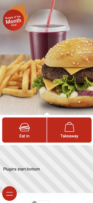
start-bottom
Adds component to start page, below start order buttons
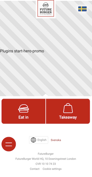
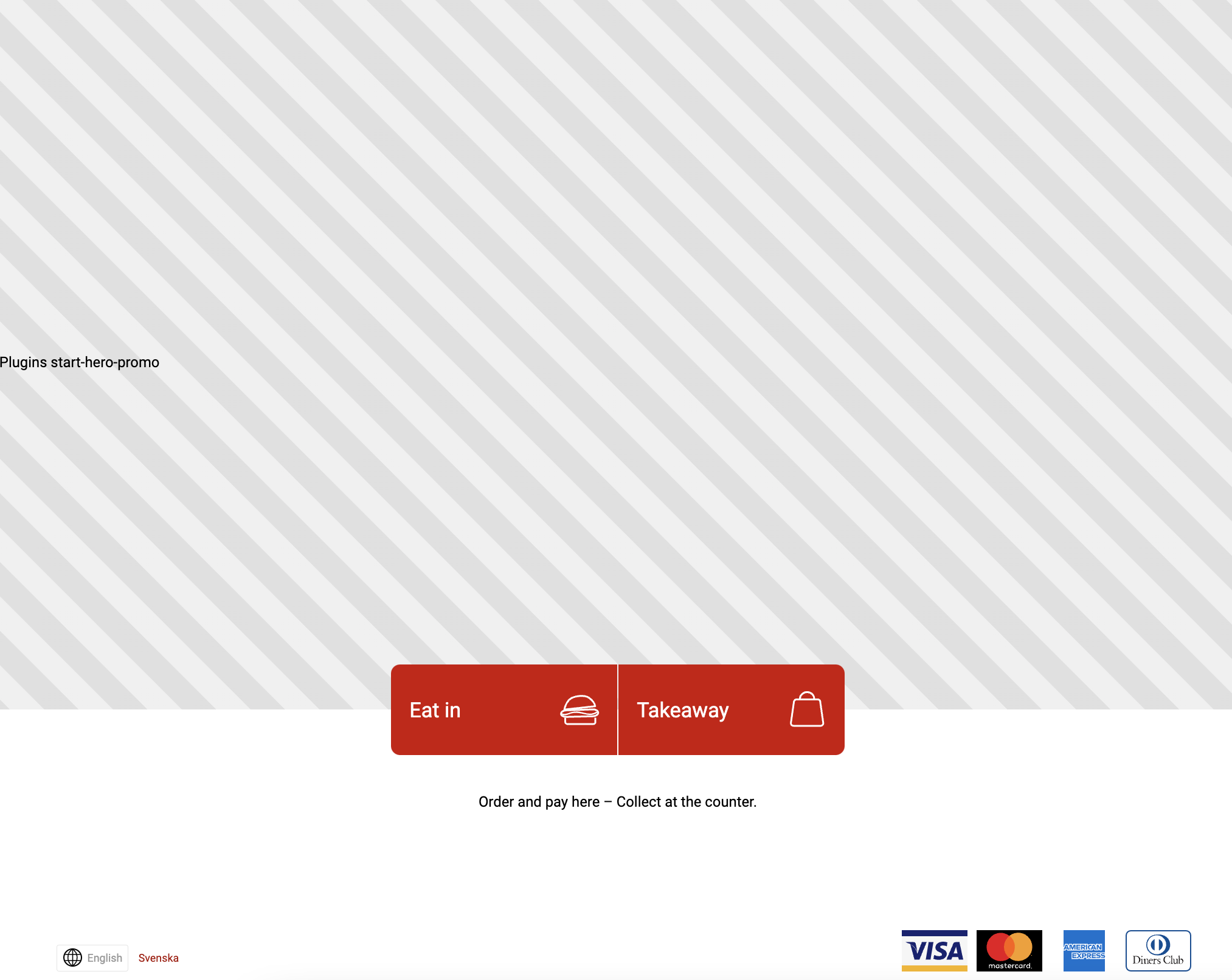
start-hero-promo
If set, default hero promo image slideshow is replaced with plugin
Web
Kiosk
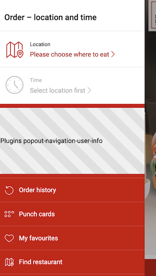
popout-navigation-user-info
Displays the component above the menu items, while hiding the default name and greeting.
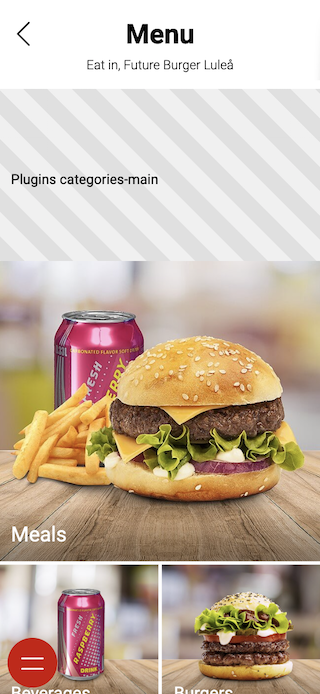
categories-main
Displays component on top of category and product listings
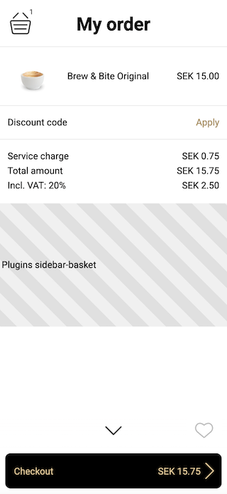
sidebar-basket
Displays component under product items in basket (when active order and not in checkout)
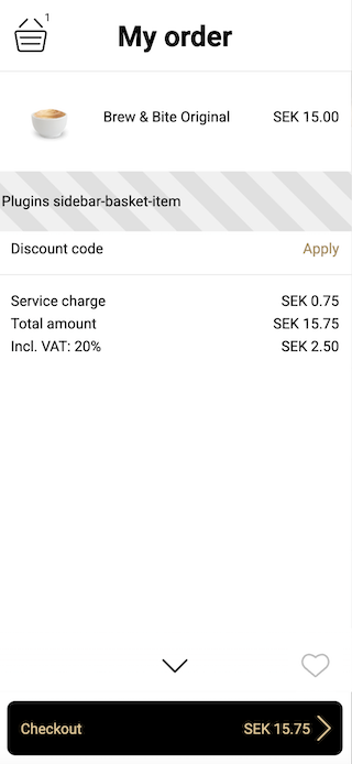
sidebar-basket-item
Display a component under each product item in basket. Use locationContext on context to retrieve info about the current item.
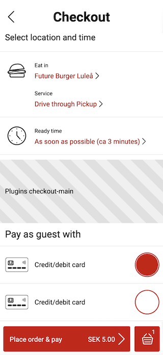
checkout-main
Displays component between order options and payment methods
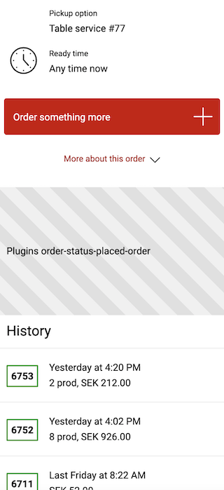
order-status-placed-order
Displays components under placed order (only when recent placed order)
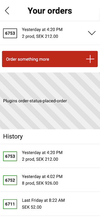
Placed order collapsed view
kiosk-closed
Replaces kiosk closed message with components
receipt-on-phone-promo
Displays component on the kiosk receipt page, directly above the "on my phone" receipt option. The option, and thereby the location, is only present when the guest can continue with the order on their phone.
When a component renders here, the component and the "on my phone" option are framed together and separated from the printed receipt options by an "Or" divider. Without a component the receipt page looks exactly as it does when no plugin is installed, with no frame and no empty container.
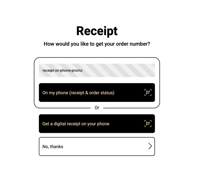
Space is tight on a kiosk in landscape mode. Keep the component below 100px in height to avoid pushing the receipt options out of view.
kiosk-order-status
Replaces kiosk order status message which shows check number and "new order"-button with component